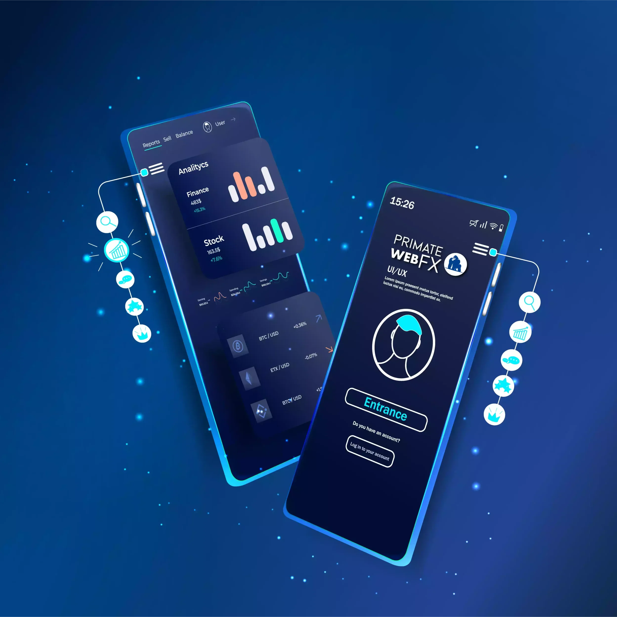
Clean & Responsive Website Design

In today’s digital world
In today’s digital world, a website is often the first impression your business makes. But what good is a stunning design if it doesn’t look great on every device? At Primate Web FX, we specialize in creating clean and responsive websites that offer a seamless user experience, no matter what screen size your visitors are using.
What Does “Responsive” Mean?
A responsive website automatically adapts to fit the screen it’s being viewed on, whether it’s a large desktop monitor, a medium-sized tablet, or a compact smartphone. This means your site will resize, reorganize, and collapse its layout dynamically to deliver a user-friendly interface without sacrificing style or functionality.
Why Choose Responsive Design?
- Accessibility Across Devices: Your audience is everywhere—on laptops, tablets, and smartphones. A responsive website ensures that no matter how your customers access your site, they’ll have an optimized experience.
- Improved User Experience: A clean, clutter-free design adjusts effortlessly to any screen, eliminating the frustration of zooming or scrolling awkwardly.
- SEO Benefits: Search engines like Google prioritize mobile-friendly sites in search rankings, meaning a responsive website helps your business stay competitive.
- Future-Proofing: As new devices emerge, a responsive design ensures your site continues to perform beautifully, saving you the hassle of constant redesigns.
- Professional Appeal: Clean, modern, and responsive designs give your website a polished look, building trust and credibility with your audience.
Our Approach to Clean & Responsive Design
At Primate Web FX, we combine cutting-edge technology with an eye for design. Our team ensures your website:
- Features intuitive navigation for users on any device.
- Uses a lightweight, clean codebase for fast load times.
- Includes mobile-first design principles, optimizing for smaller screens without compromising the desktop experience.
- Follows the latest trends while ensuring your unique branding shines through.
How We Make It Happen
We use advanced tools like Beaver Builder and PowerPack, alongside WordPress’s robust platform, to create websites that are visually appealing, functional, and responsive. By leveraging our expertise, we build a site that isn’t just trendy, it’s timeless.
Let’s Build Your Perfect Responsive Website!
Ready to take your online presence to the next level? At Primate Web FX, we’re passionate about creating websites that work hard for your business. Whether your audience is on a 27-inch monitor or a 5-inch smartphone, your site will look and perform flawlessly.
Contact us today to get started on your clean, responsive website design!